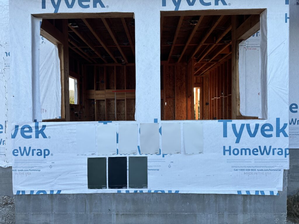
When I’m not taxiing around teenagers and hurling my resume into the job black hole they call LinkedIn, I’m still building a house. We’re making progress and as you might imagine, I learn something new most days. For example, when it seems like you’re a million months from needing a painter, I found out you have to have the fascia boards painted before they install the roof. Or at least before they install a standing-seam metal roof. For those readers wondering what I just said, the fascia boards are basically the trim along the roof line. Nice of the roofer to point this out the day he was supposed to start installing… instead of during the countless months we’d been texting and quoting and installing the underlayment.
Coincidentally, my best high school girlfriends are currently in the thick of a text thread discussing paint, prompted by my friend Sarah. Sarah is famous for giving herself numerous choices. I am famous for asking her why on earth she’d bring five hats to a weekend getaway. We make a great team that laughs a lot. And so in an effort to save Sarah’s sanity, I thought I’d share some considerations on choosing exterior paint colors.
DARK vs LIGHT
Your first consideration is whether you’re planning to paint the body of your house a dark color or a light color. I’m sure both have objective pros and cons but I’ll share this– dark houses are like dark cars. They show more dirt. And white bird poop. The color also fades faster. Side note– spring for high quality, name brand paint like Benjamin Moore, Sherwin Williams, Kelly-Moore, etc. The contractors who painted our barn a charcoal gray cheaped-out and color matched to an off brand. We had to paint the whole thing again way sooner than we should have.
DIRT
Now here’s a tip you won’t see on all those fancy shmancy design blogs– look at your dirt. Or soil for you ag teachers. The dirt surrounding our home is chalky and white thanks to the Carmel stone that makes up this mountain. It leaves a fine white dust all over the dark, moody barn. Our new house paint color will be a close match to our dirt. But obviously way prettier.
TRIM
James taught me that old houses almost always have a three-color paint scheme. The body is one color, the window trim is a second color, and the window frames are a third color. Drive through some old neighborhoods and you’ll see what he’s talking about. Of course it all depends on the age and architecture of your home. Look around your neighborhood to get a feel for how your house fits in.
COLOR
Consider the colors of your neighbors’ houses. Consider the color of your roof. And consider your landscaping. This should hopefully get you into the color family you’re leaning toward. Now here’s where we get down to a simple process for choosing a paint color from thousands so you can get back to that weekend getaway featuring multiple hat wardrobe changes.
Step 1: Search “best <insert color> exterior paint colors” on Pinterest.
It helps if you kind of know which way you’re headed– white, green, gray, etc. This will help you narrow your choices down to a handful of paint brands and names. I generally use this method to find two to three designers’ pins and their go-to colors. They all have posts like “our most used exterior paint colors” or “the 10 best exterior paint colors.” This dramatically narrows your choices and you can usually find pictures of homes painted in that color in their portfolios.
Step 2: Spend a little bit of time on a paint comparison blog or YouTube.
Yes, there are people in this world waxing poetic on the LRV (Light Reflective Value) and undertones of various paint colors in relation to each other. I kid you not. For example, I was trying to choose a white for those pesky fascia boards. I had a handful of paint names from Step 1, and then my friend recommended the color of her house. That’s when I found Kylie M. Interiors. This lady literally compares all the whites I’d been looking at, explains their undertones, includes the history of their popularity, and then lands on which one is better. Second side note– I’m generally looking for neutral or minimal undertones. I can usually live with it having some gray or beige undertones, but if it’s leaning purple, pink, yellow, or green, it’s going to make me feel weird. These detailed sites are a bit much for one-hat me, but boy am I glad someone likes doing this. Get in, get out, move on to step three.
Step 3: Buy peel-and-stick samples on Samplize.
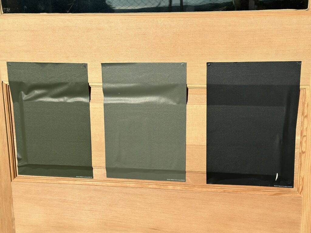
These are computer paper-sized swatches painted with the actual paint. They’re less messy and infinitely more portable than little sample pots of paint. Plus they fit in your mailbox. Put them up and then stroll by them at different times of day as the light changes. You can peel them off and move them around. I also like to write on them when I realize what’s wrong with the color such as, too brown, or looks green, or just yuck. I’d recommend buying no more than seven choices of one shade. So like 5-7 whites, or 5-7 grays. They’re about $6 each so that keeps you under a $50 budget for this decision.
Step 4: Choose a color and then stop looking.
This part is especially important for those of you in the pack-five-hats club. Debate. Decide. Commit. Your house is going to be beautiful!


